Summary
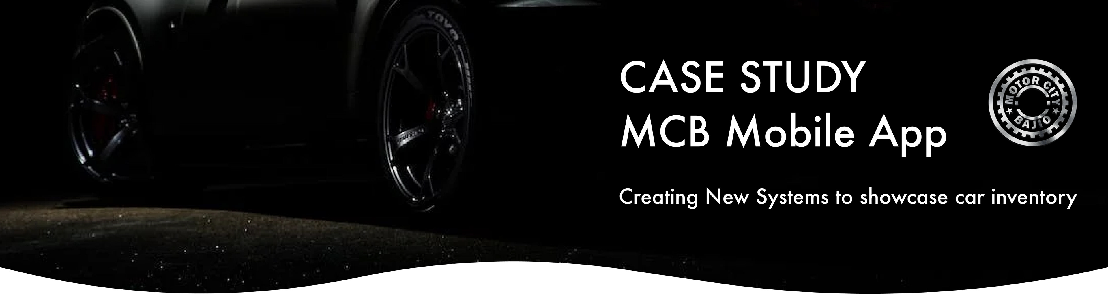
Motor City Bajío team contacted me to help them revolutionize their way of showcasing and sorting car inventory with an Interactive, efficient and engaging system, along with improving its client-company communication in the Mexican Market.
Client: Motor City Bajío (Car dealership company)
Sector: Retail Trade Sector
My role: Project Lead, Conduct UX and Design UI
Team: UX, Company Management, Marketing Team and Engineering Team
Tools: Figma, Zoom, Facebook Polls, Typeform, UsabilityHub, Microsoft Excel.
Sector: Retail Trade Sector
My role: Project Lead, Conduct UX and Design UI
Team: UX, Company Management, Marketing Team and Engineering Team
Tools: Figma, Zoom, Facebook Polls, Typeform, UsabilityHub, Microsoft Excel.
No much time?
3 Minutes story...
The success of this project was due to the effort of the company teams on:
• Marketing
• Management
• Software engineer
• UX (My role)
• Marketing
• Management
• Software engineer
• UX (My role)
I iterated three phases of research and two main phases of design to develop the project.
Phase 1 - Strategy (Research & Analysis) : Define and validate the Project Goals (stakeholder interviews, competitive Analysis, semi-open interviews, etc.)
Phase 2 - Design (Sorting System cat & Post) : First proposals, low fidelity systems to achieve our project goals (sorting system focused)
Phase 3 - Research / Design (Validating the CTA & Post Design) : Evaluate the proposals to move on with the most accepted system (AB and ranking test)
Phase 4 - Design (Low Fidelity Wireframes for Official Systems) : Low Fidelity Wireframes for the official systems
Phase 5 - Design / Research (Color Palette & Branding) : Define color with the marketing team to maintain company branding and validate user acceptance of color decisions (AB test-survey)
Phase 6 - Design : High-Fidelity Wireframes
Phase 7 - Validating : Rapid Prototype to validate App navigation and sorting system times.
Click Images to expand

From this...
to this
More time?
Read the 15 minutes story...

Design Approach
Pain points
MCB clients' and employees' reports show the following fact issues:

so I created, PHASE 1 - Research & Analysis - Strategy
Research Plan
The objective was to find a broad sentiment on systems to showcase car inventory from both the company and user perspectives. I performed the following studies:
- Stake Holder interviews
- Competitive Analysis
- Semi-open user interviews
- Semi-open interviews with MCB employees
- Competitive Analysis
- Semi-open user interviews
- Semi-open interviews with MCB employees
Project Goals
I defined the goals based on the analyses of our research plan and maintaining the company's vision.

PHASE 2 - Sorting System (CTA & Post) - DESIGN
First proposal
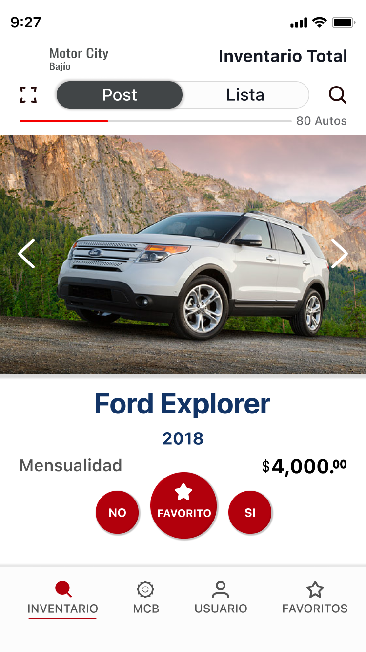
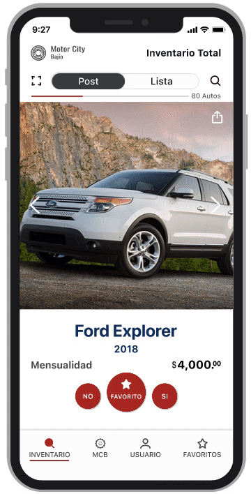
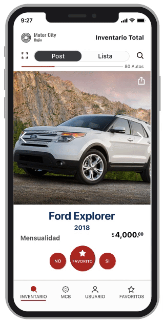
To fulfill the dynamic system that the company wanted and the user needs reflected on research phase 1, I designed the first proposal for a sorting system that uses three floating buttons (CTA) and a car post that showcases information in a way that users can process efficiently.
PHASE 3 - Validating the CTA & Post Design - Research / Design
CTA
Testing the CTA before moving into the medium-fidelity wireframes was a high-priority task, so I designed an AB test with the following proposals.
MCB management team proposed a company oriented CTA function.
UX proposed a user oriented and simple design system.
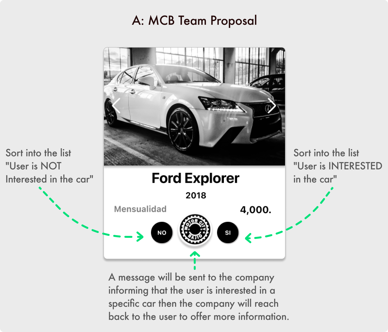
MCB Proposal
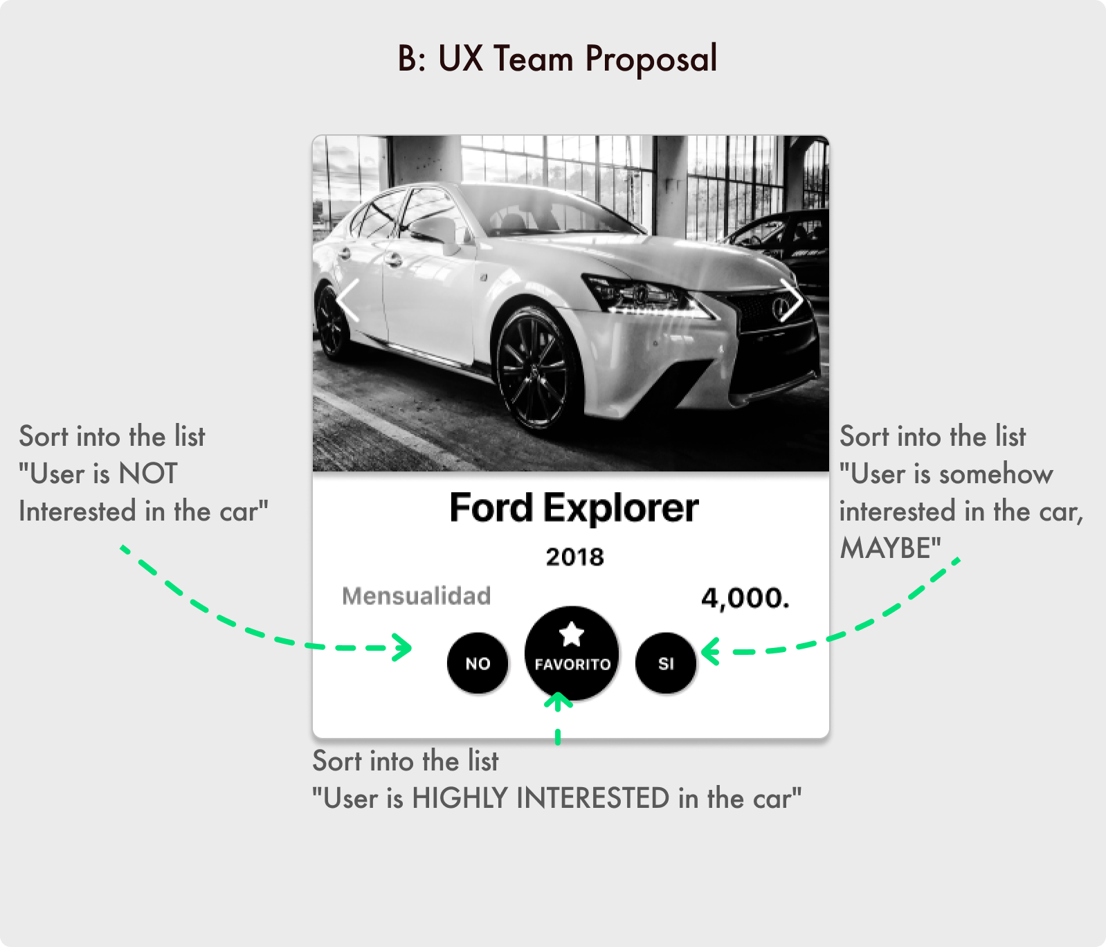
UX Proposal
Spanish - English
Si = Yes | No = No | Favorito = Favorite
CTA Decisions
Based on the AB Study learnings, we decided to move on with the user oriented - simple design system B.
Option A | 33% acceptance
"The MCB logo was confusing"
"I don't like companies reaching out to me"
"I rather calling on my own time."
"The MCB logo was confusing"
"I don't like companies reaching out to me"
"I rather calling on my own time."
Option B | 67% acceptance
"I like the design"
"I like the efficiency of the button on different lists"
"I can take a look any time to my lists
"I like the design"
"I like the efficiency of the button on different lists"
"I can take a look any time to my lists
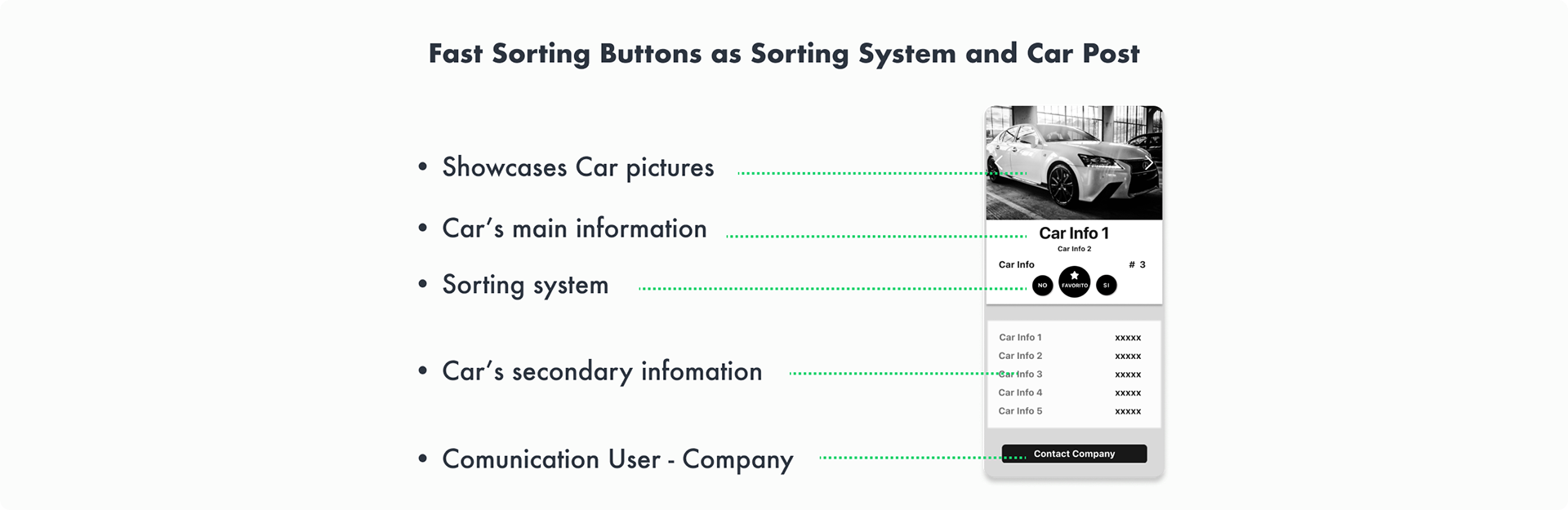
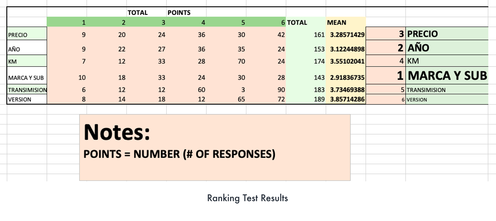
Car Post
The next critical question was about what informations is the most important for the users to know when buying a car; to solve this, I performed a ranking test that showed the following results.
The minimum users want to know when searching to buy a car is:
- Make and Model
- Year
- Price
- Year
- Price
Spanish - English
Precio = Price | Año = Year | KM = Kilometers/millage | Marca y Submarca = Brand and Model |
Transmisión= Transmission | Versión = Version
PHASE 4 - Low-Fidelity Wireframes on official systems - Design
Post and Sorting systems
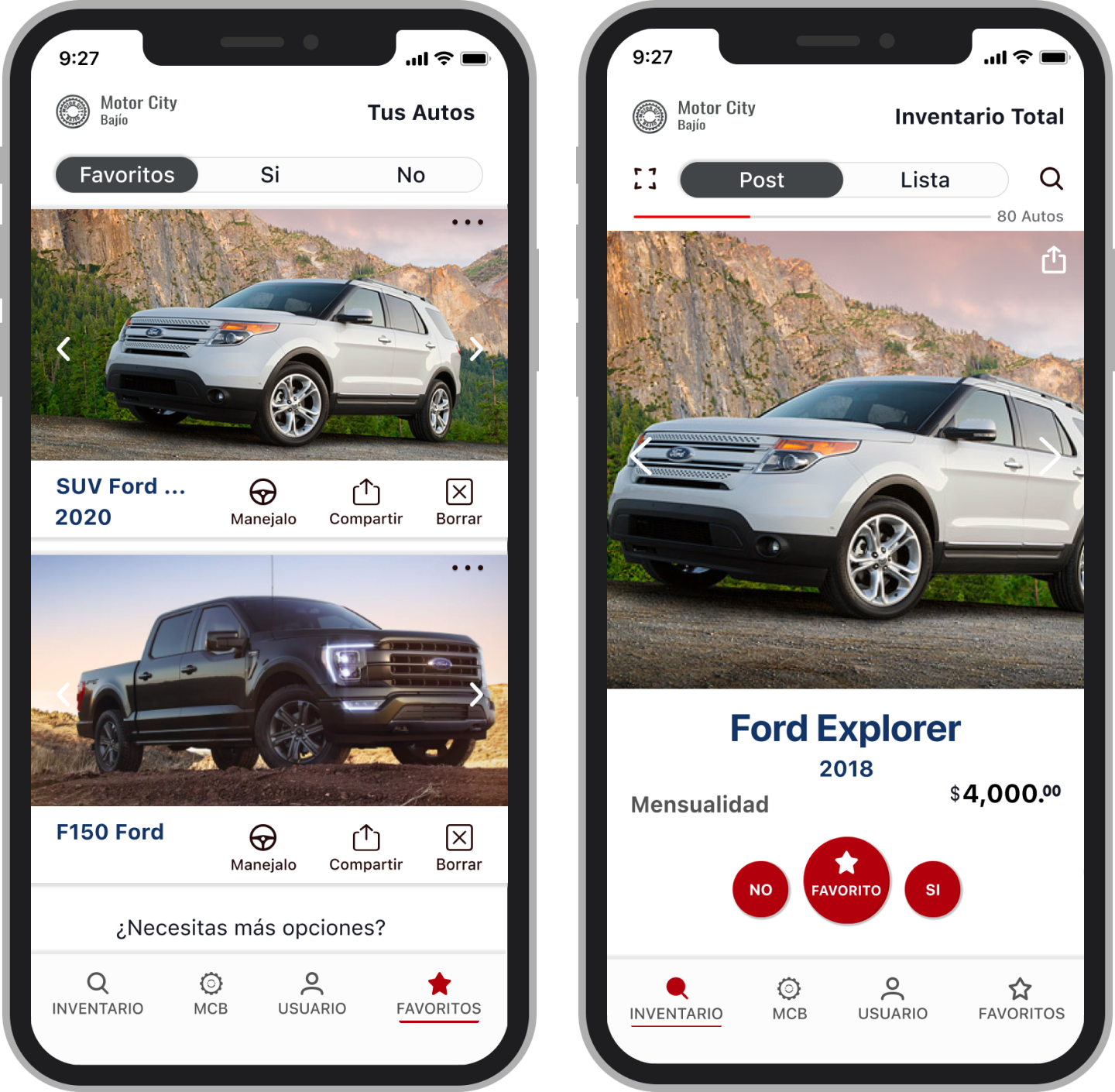
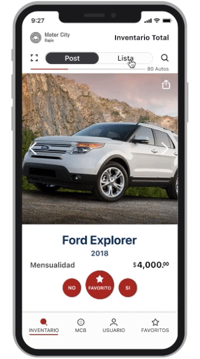
Based on the learnings of phase 4, I designed the posts to showcase the Car Inventory with Basic car information and Innovative Sorting systems.
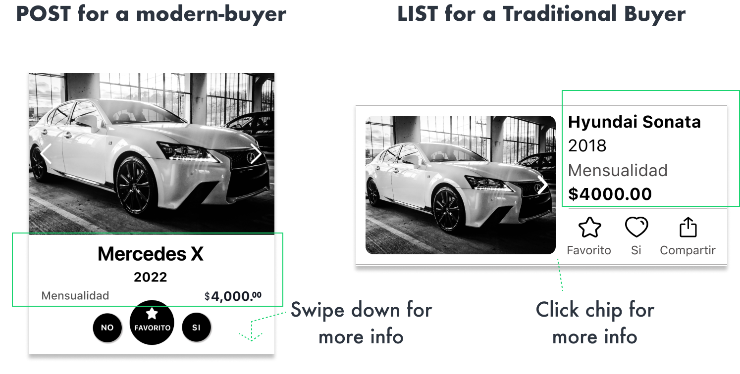
Spanish - English
Mensualidad = Premium | Si = Yes | No = No | Favorito = Favorite | Compartir = Share
Medium Fidelity Wireframes
After the Post was designed and validated, we were ready to move into the rest of the wireframes designs. Meet the Home Page of the MCB app on Post and List view.

Spanish - English
Post = Post | Lista = List | Autos= Cars | Mensualidad = Premium | Si = Yes | No = No |
Favorito = Favorite | Compartir = Share
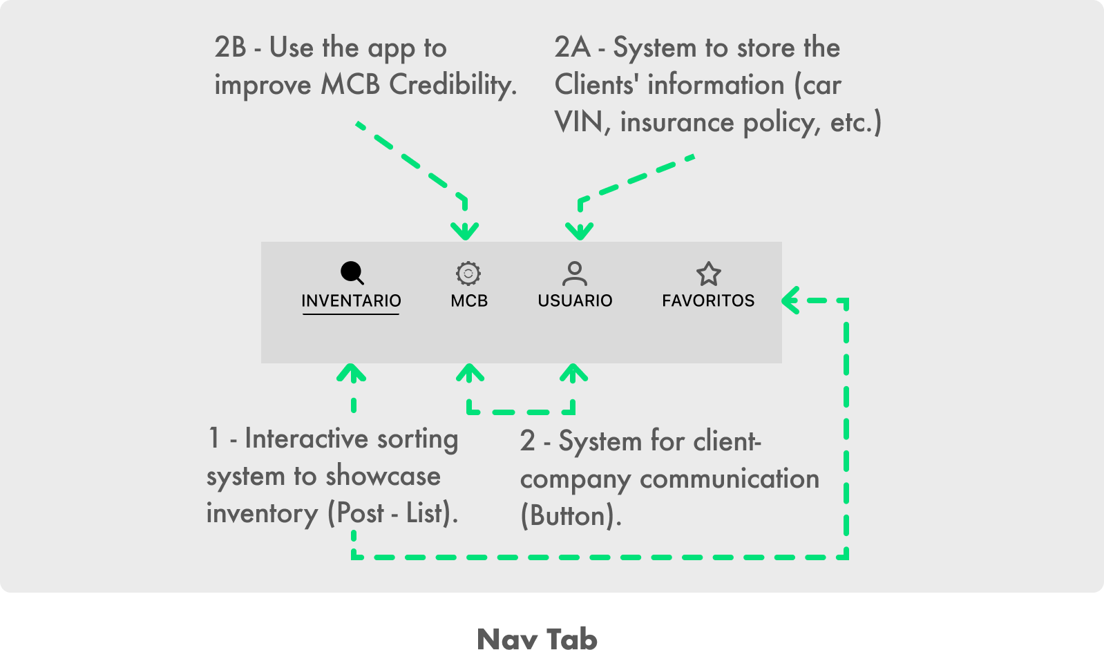
Nav Tab
I designed a navigation for users to access different information while using it to communicate with the company.
PHASE 5 - Time for color and maintaining company's branding - Design / Research
I built the color palette based on MCB Marketing Team insights and a company's web page analysis.
✓ Red keeps the branding with the web page and other MCB social media presence.
✓ Blue is used to build trust in the user.
✓ Although the web page uses dark background, we used white on the mobile app to maintain AAA Accessibility standards.
✓ Dark and gray colors are used to contrast text and help the user with faster detection of important information.

CTA Color
I designed two different tendencies for the sorting buttons (CTA):
- Gray to show elegancy
- Red to follow branding and show a most aggressive look
- Gray to show elegancy
- Red to follow branding and show a most aggressive look
79% of users rather the Red Design compared with 21% that rather gray.
User Insights:
"Red designs grab my attention better than the gray"
"Gray is elegant but red is more vibrant"
"Red looks the best"

Elegant Style
Vibrant Style
PHASE 6 & 7 High-Fidelity Wireframes and rapid prototype
Wrapping Up...
Interactive Sorting System
Reduce +60 % sorting time when a user is navigating the car navigating inventory.
POST View
Fast Sorting Buttons for a Modern-Buyer.
LIST View
List with sorting options for a Traditional-Buyer.
Personalized User Experience
User can make personalized lists of favorite, interesting and non wanted cars, this increases the satisfaction, confidence and engaging of users while choosing a car
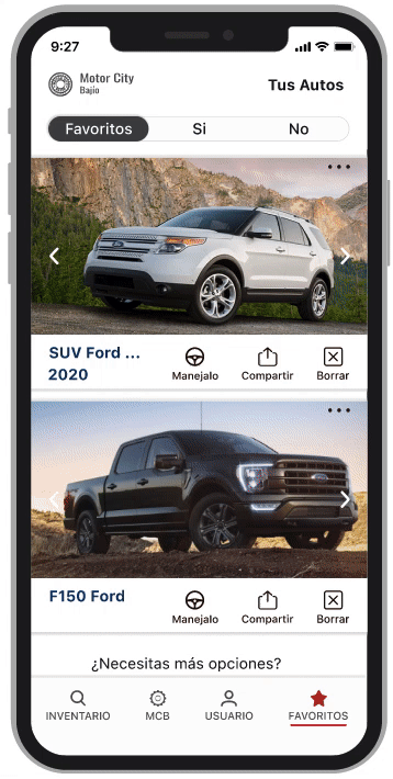
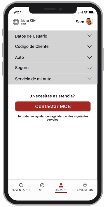
USER and MCB Screens
Users can store their information and use it to communicate with the company while accessing documentation and media presence to increase company's trust.
LEARNINGS
Getting to know the practices of the car dealership was exciting. I'll mention two crucial times in the project.
The first research phase was challenging. Not the smoothest time! It took numerous meetings with the marketing, management, and UX to define the goals finally. Since day one, the lesson learned is to vigorously pursue the project-specific goals and maintain open communication with all stakeholders; everyone on the same path will make a more substantial project base.
One of the successes of the project was the sorting system. Seeing everyone pleased! UR validated this as being innovative, practical, and user-friendly; all of these values the company required.
What's next?
The company is interested in expanding this concept outside of the dealership, right now, the Mobile App is designed to showcase the inventory in the company, but they want to expand the App to manage inventory in other dealerships or private owners. This is a phase for them to test the App's functionality before expanding.