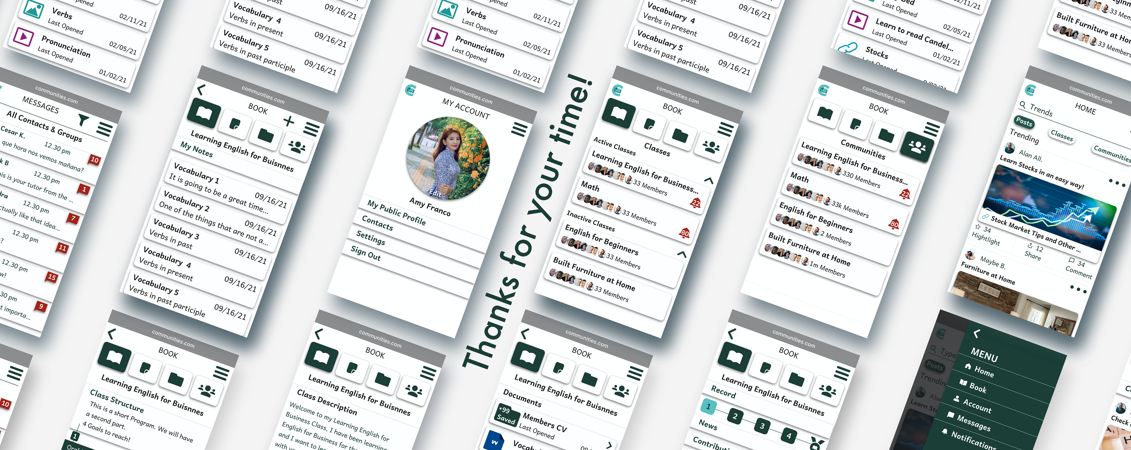
Communities
A Web App that enhances informal Community Learning and allows users to keep files, links, notes, and videos organized to promote an efficient experience.
Client: Student Project at CareerFoundry (CF)
Sector: Education and Networking
Sector: Education and Networking
Timeline: March-April
My Role: UI design and conception detailed
My Role: UI design and conception detailed
Tools: Adobe xd & Sketch


| Project Overview
Objective
Connect students and professionals online to facilitate peer-to-peer learning support, feedback, and motivation. Users come from different fields or backgrounds and seek a consistent learning experience.
Our App
This responsive web app aims to facilitate connection within users that have similar learning needs. Links, videos, documents, and more, can be shared to promote learning or feedback within a created community. In addition, classes are designed to assist with closer support within peers on a specific topic. The app also supports a system to keep files organized and at hand for an individual learning experience.
•Prototype
Prototype A | Flow: Create a new account.
Prototype B | Flow: Navigate App core functions.
|| Video Presentation

| Persona
Based on the client's requirements and to obtain a better understanding of the users' needs, I created a persona.

| App Features
• Personal profile including image, subject, specialization, interests, location, favorite articles/books.
• Search feature (search by name, subject, location).
• Contacts/friends list.
• News/updates reel.
• Private/direct messaging feature.
• Social features: following, sharing, reacting to posts, commenting, posting, including file upload for PDFs and docs, presentations, images, videos, and links.
•System to keep files organized.
•System to create classes (Syllabus, tasks to complete, lessons, etc.)
•Notifications feature.

| Low-Mid Fidelity Prototypes
With the main app features on hand, I designed low and mid-fidelity wireframes.

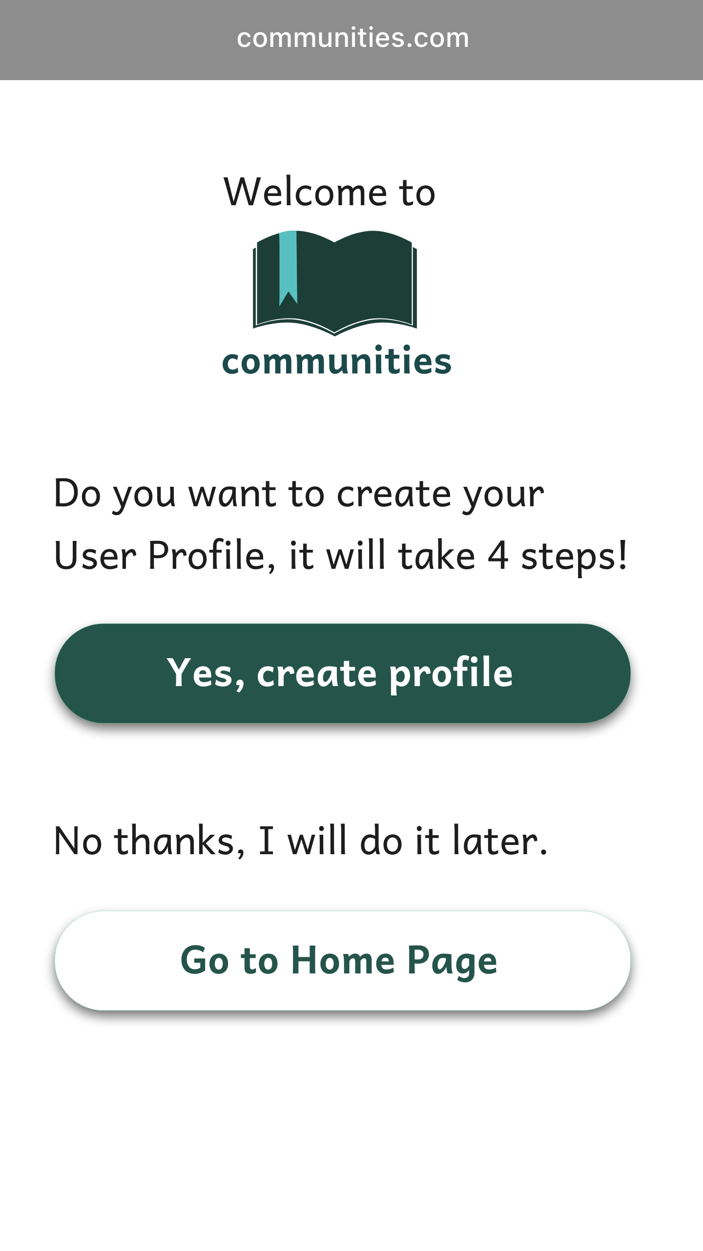
Sign Up
Personalized Profile

Go to Home Page

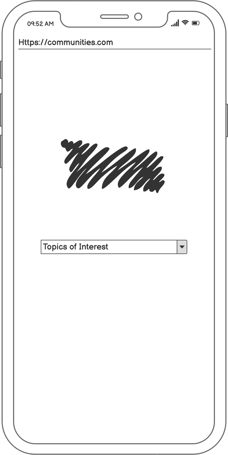
Search Topics
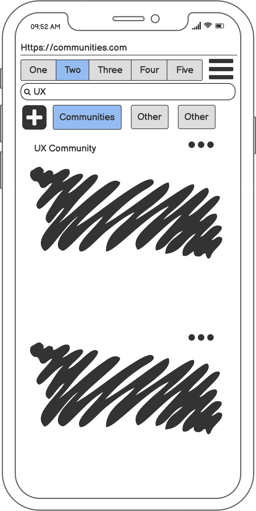
Home - Filter Chips
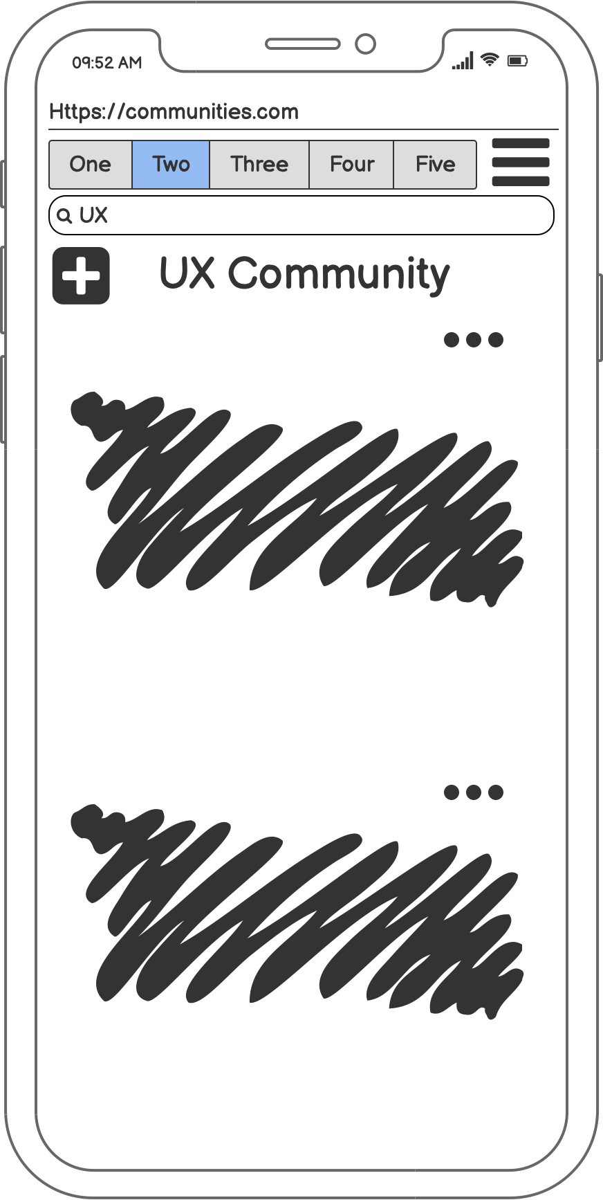
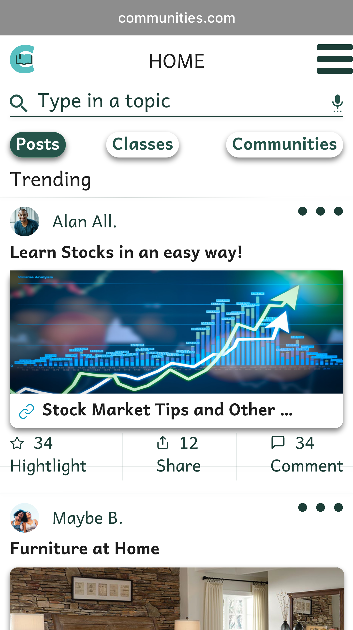
Home
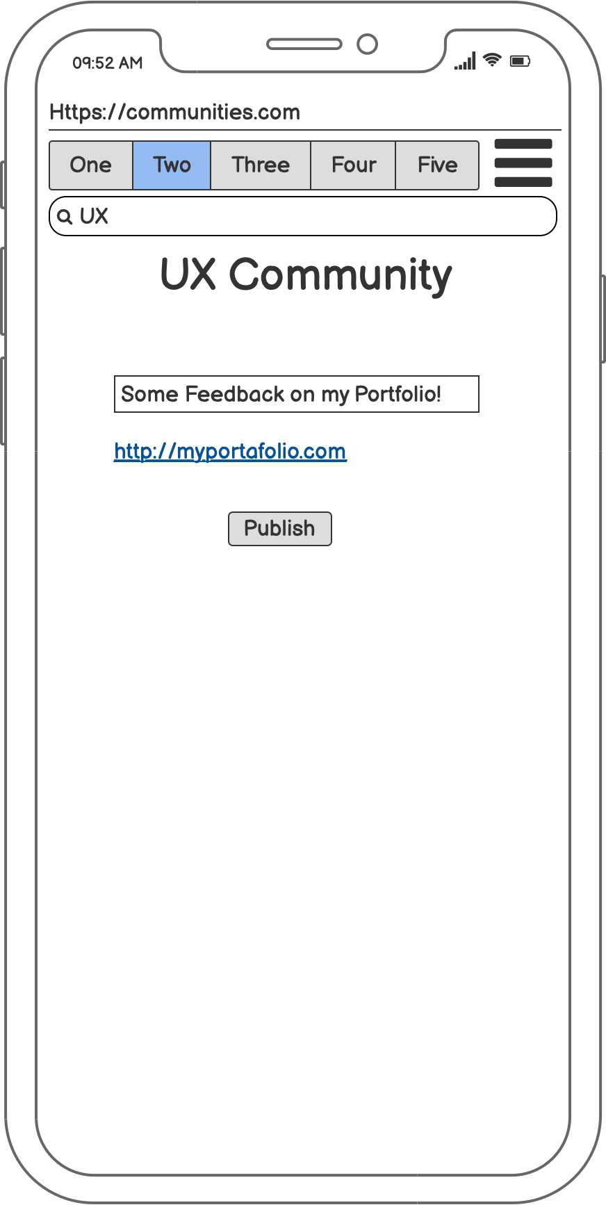
Add Post Looking Feedback
Home Page
Menu

Book Tabs
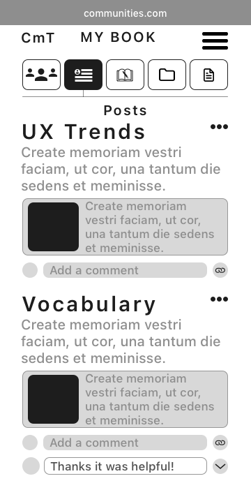
Saved Posts
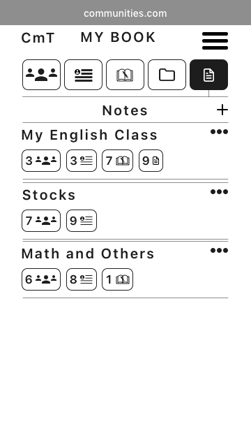
Notes
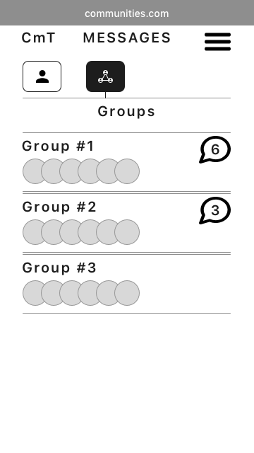
Messages
|| Mood Board
To move on with high-fidelity prototyping, I made two mood boards and collected users' feedback from an AB Test. The fun and welcoming spirit of option B were more accepted than the formal layout on option A.
Option A "Formal Learning Interaction"
Option B 'Fun and Welcoming Spirit'
||| Typography
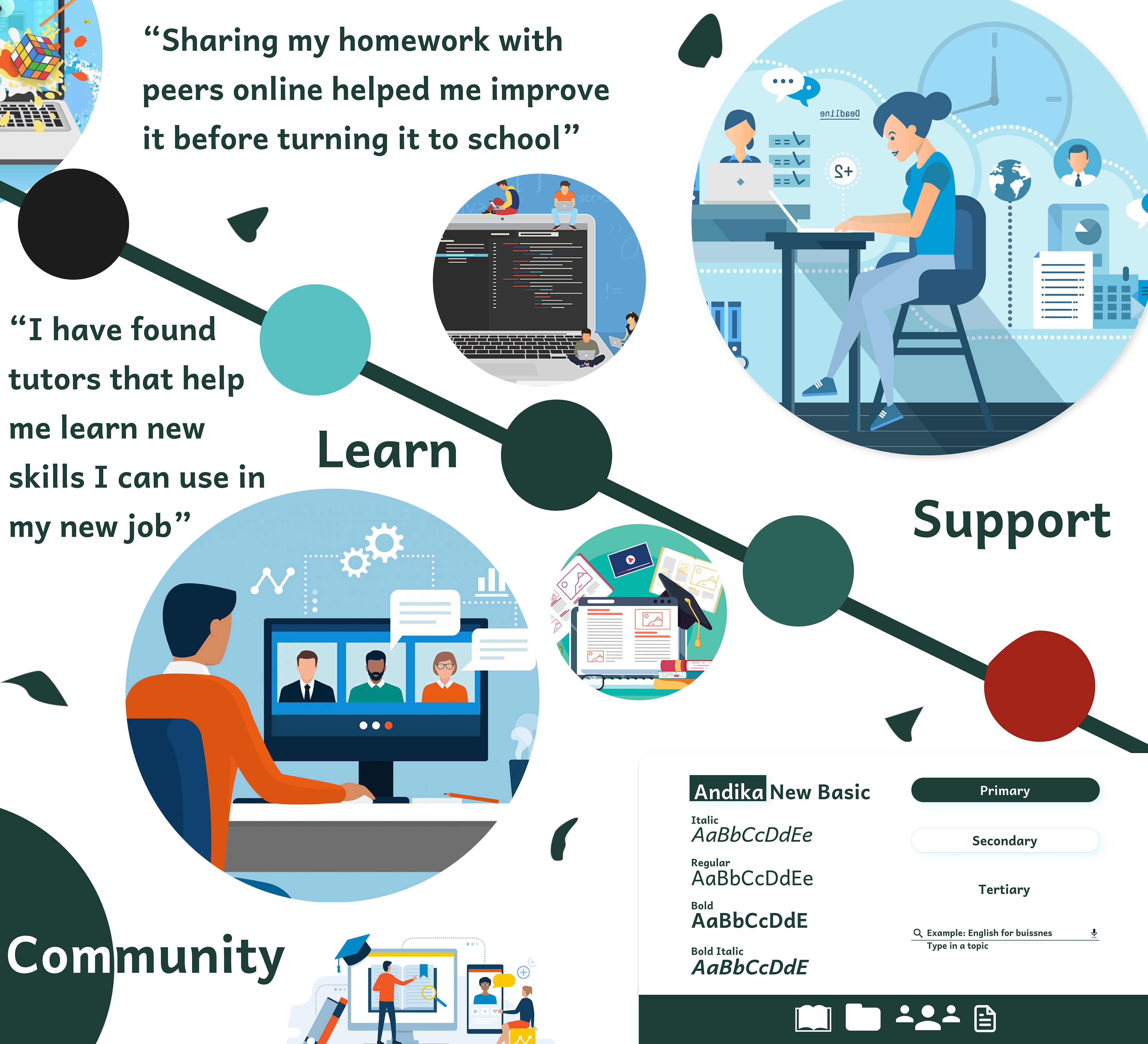
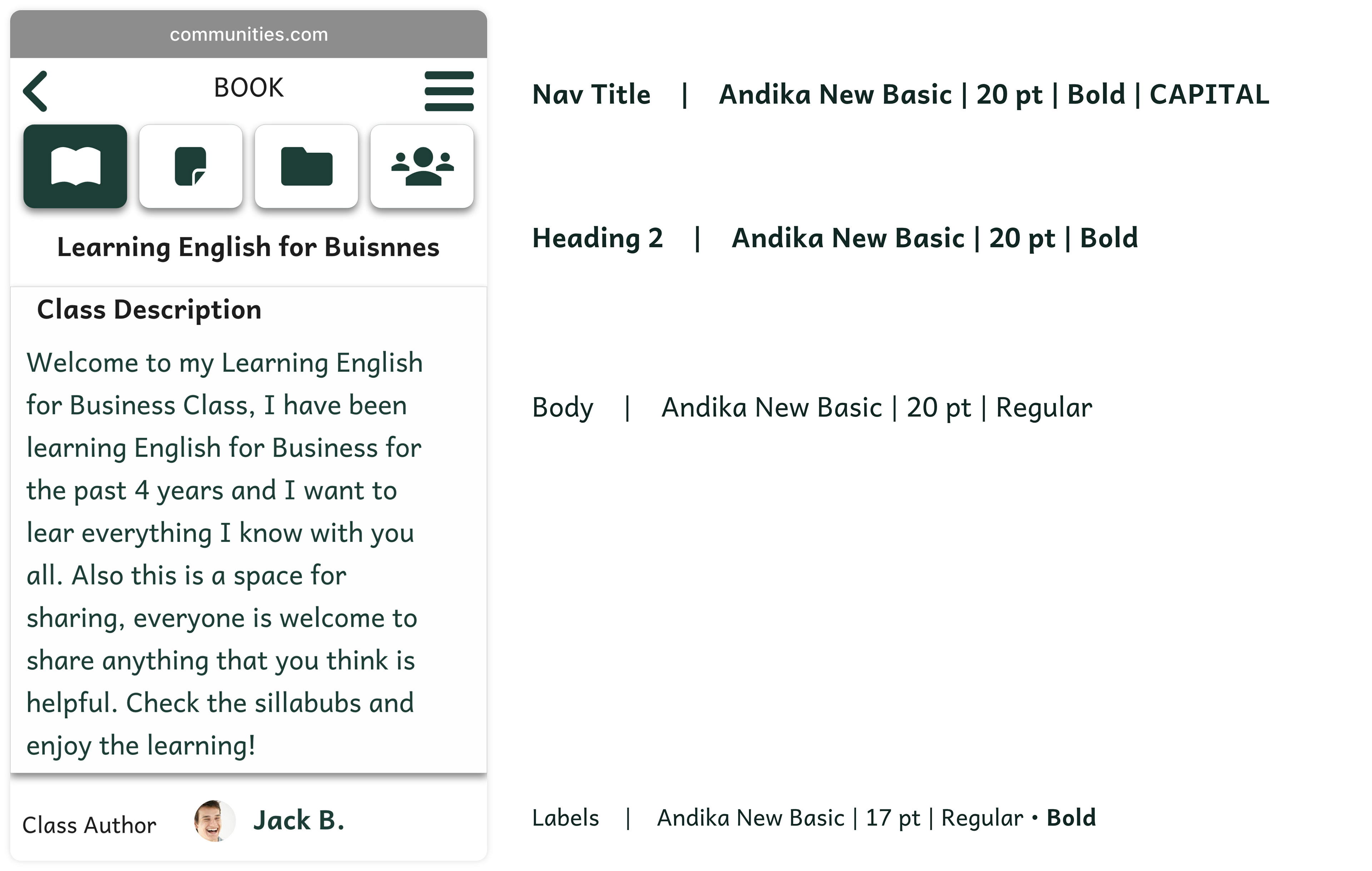
The app intends to help users learn different topics. Reading is a main activity throughout the app; therefore, the typeface selection is a decision that highly impacts the app’s performance.
I decided to use Andika New Basic, a Send Serif Unicode-compliant font designed especially for literacy use. It is a typeface created by SIL International, a faith-based nonprofit organization committed to serving language communities worldwide as they build capacity for sustainable language development.
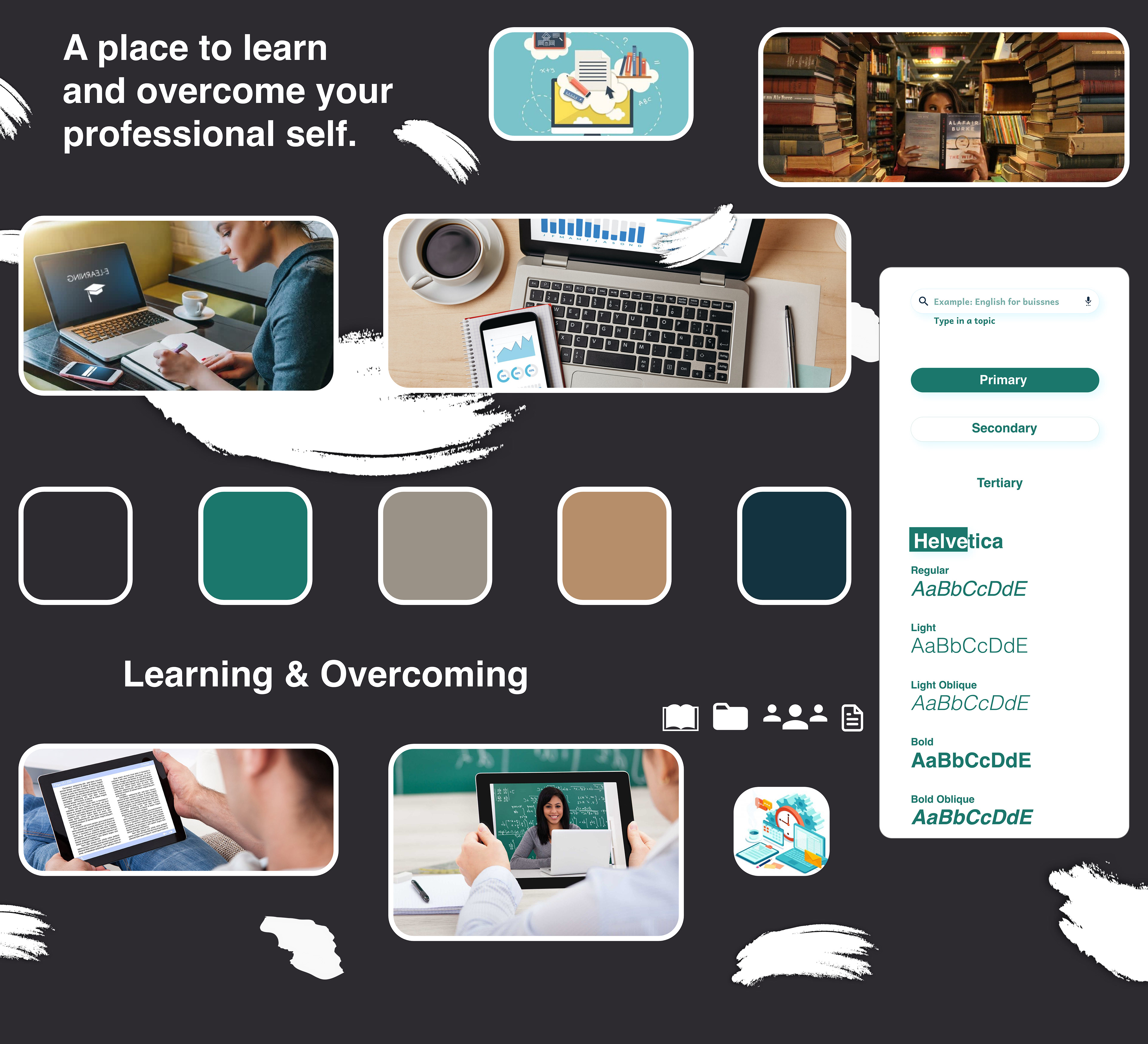
|||| Color
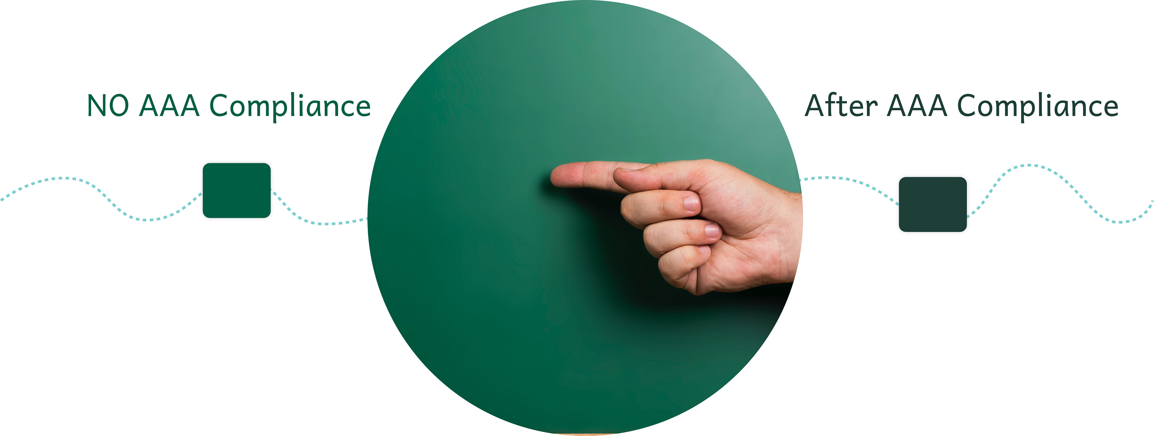
The app has a high volume of written content; I decided on denoting simplicity as a priority. Therefore, I decided to go green as the primary color, dark green and black as complementary, and blue as the accent color. I selected the nearest green to a chalkboard used at schools back in the day to provoke a correlation with a learning experience; after this selection, I adjusted the tone to reach AAA compliance.
||||| High Fidelity Prototyping
After I decided on colors, typography, and style, I continued to create high-fidelity prototypes.

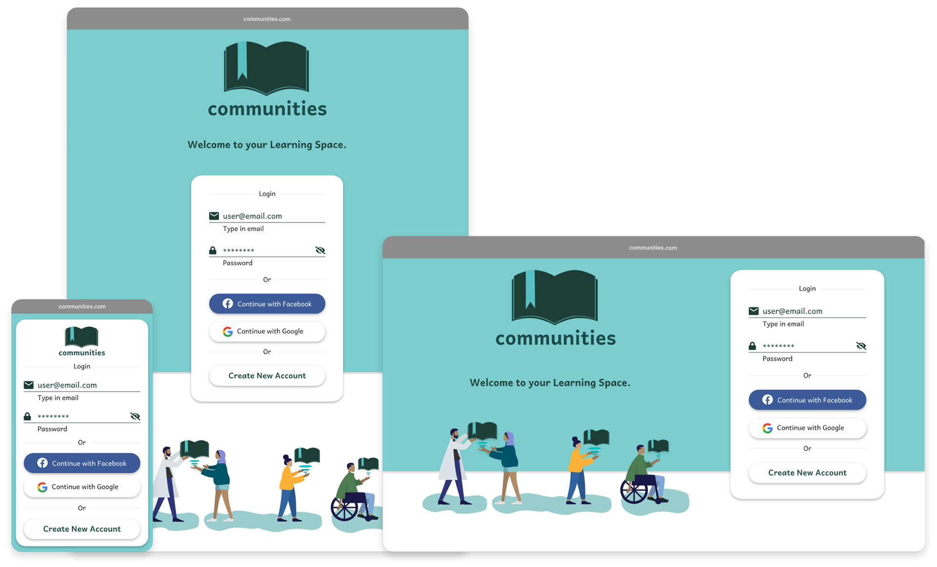
Sign In
Personalize Profile
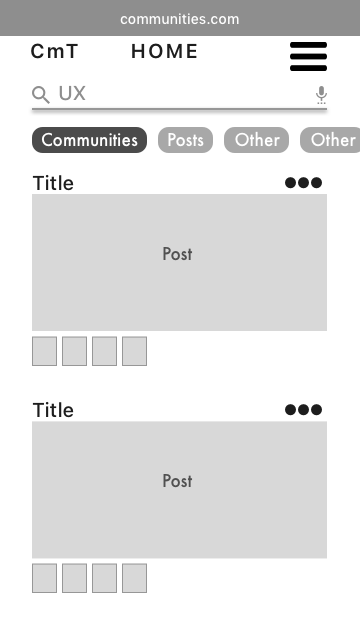
Home

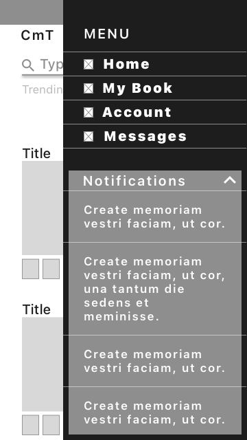
Menu
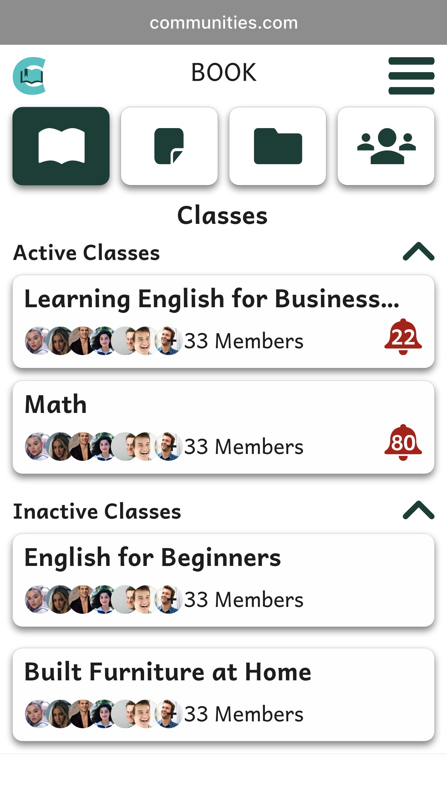
Classes History
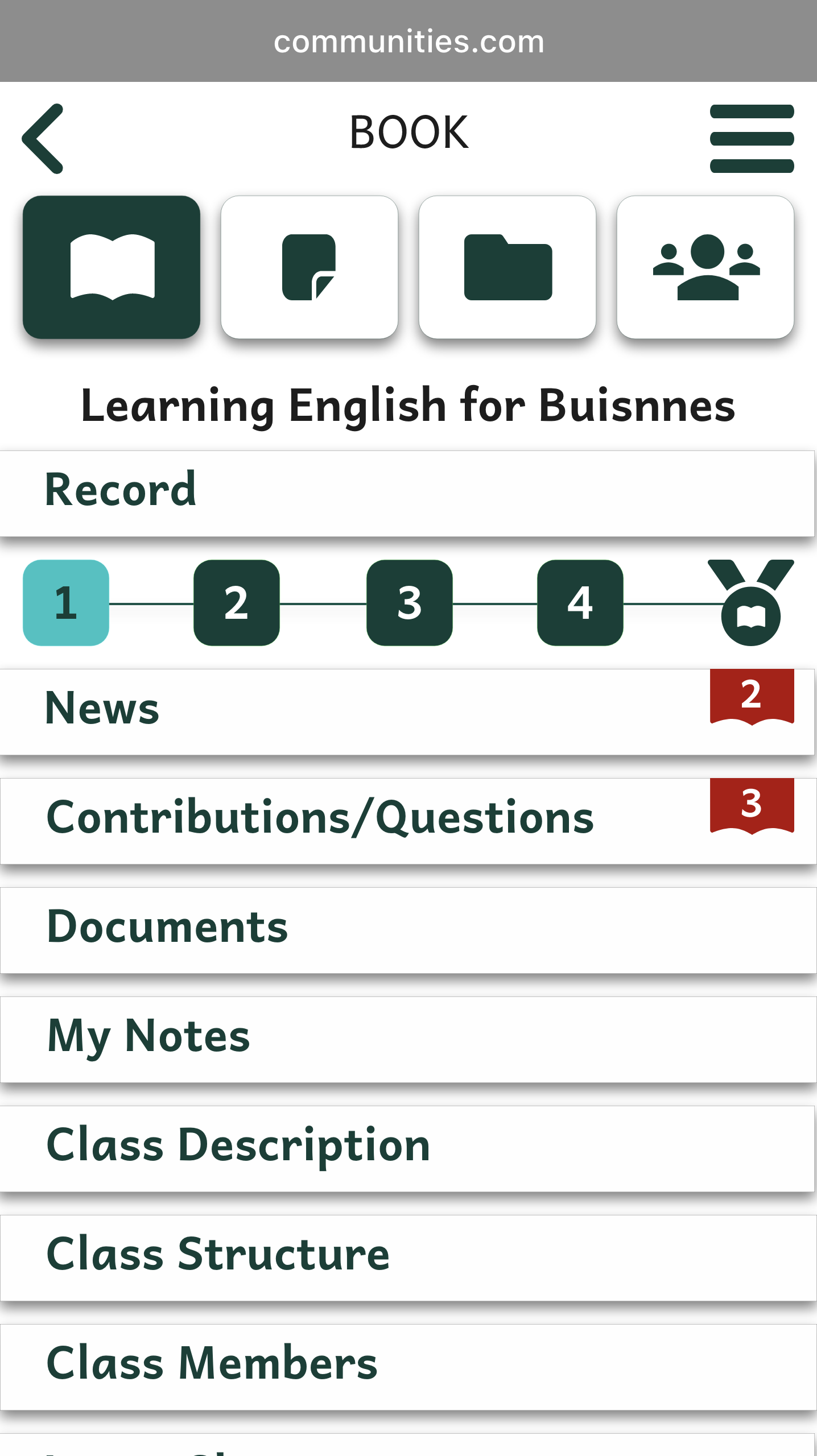
Class
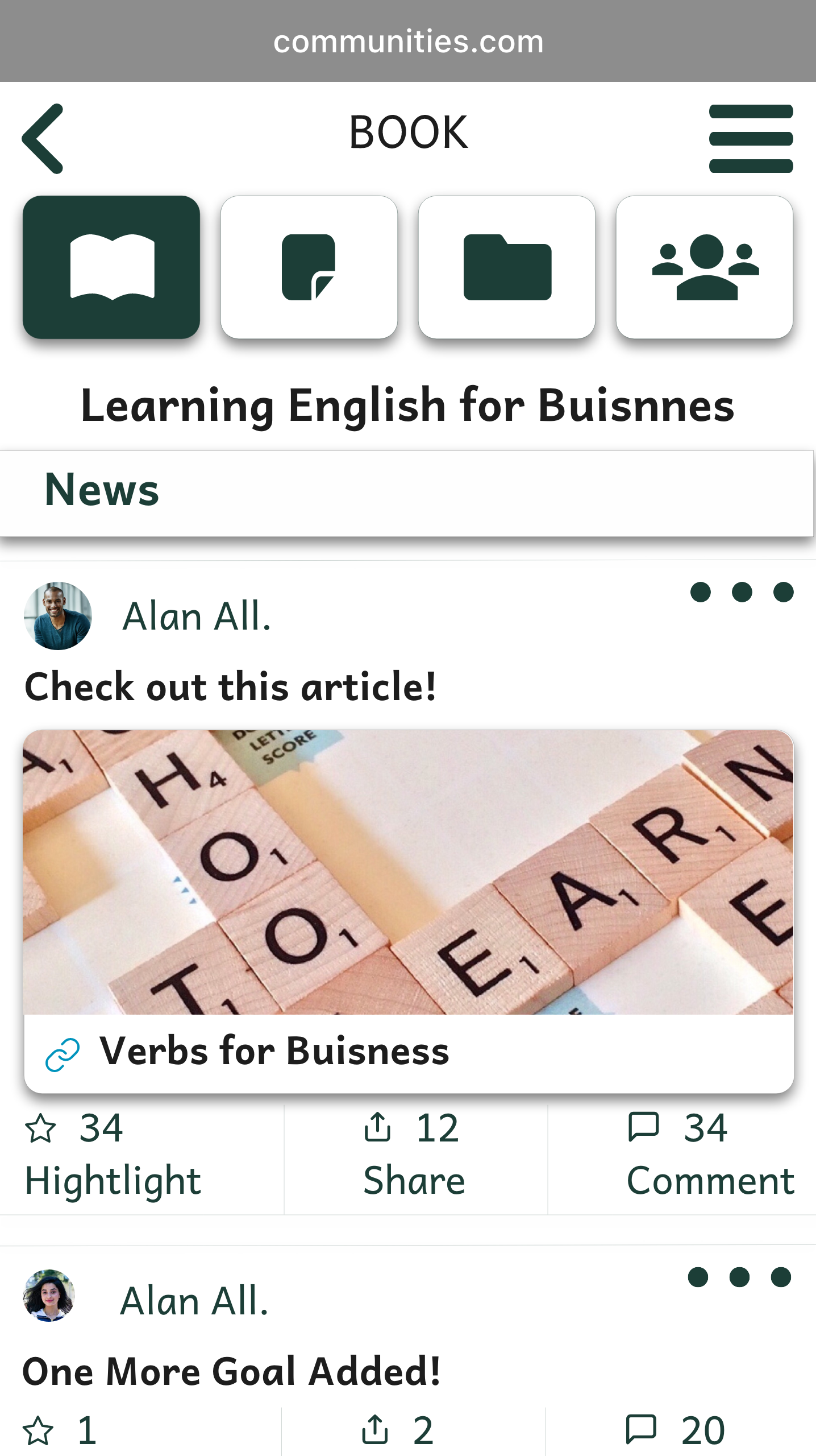
Class News
|||||| Style Guide
I decided on the essential pieces to add to the Guide Style in order to keep consistent navigation on each breakpoint.
•Logo
•Color Pallets
•Typography
•Iconography
•UI Elements
•Grid
•Imagery
•Gestures
•Color Pallets
•Typography
•Iconography
•UI Elements
•Grid
•Imagery
•Gestures
||||||| Breaking Points
I designed breaking points for the web, iPad, and Portrait Mood.
Sign In Page
Home Page

| Learnings
I enjoyed working on this project; it was an excellent opportunity to apply techniques and recently learn UI concepts. The timing for this project was shorter than my previous one, which challenged my soft and hard skills. To comply with the deadline, I had to keep my schedule and files deeply organized what made this journey exciting.
The most arduous part of the project was starting the prototyping phase due to some technical issues. I made the first prototypes of the app in Sketch to gain experience with this tool. My first thought was to prototype these wireframes on Invision; when I exported my files, the program did not support all the editions due to some version incompatibility. My timing was already short, and I had broken design wireframes for the prototype, so I decided to redesign in Adobe XD since I have more expertise on it. I ended up with Sketch usability experience and a prototype made on time in Adobe XD.
|| Next Steps
•Conduct Usability Testing to validate design decisions.
•Iterate on the product based on user feedback.
•Run user interviews to expand the Reactions for Post. For example, the current feature "highlight" can have more specific emotions like "useful," "interesting," ''professional.''
•Iterate on the product based on user feedback.
•Run user interviews to expand the Reactions for Post. For example, the current feature "highlight" can have more specific emotions like "useful," "interesting," ''professional.''